Showing posts with label fontfun. Show all posts

12.6.13

FONTFUN: Font of The Week - BDMarseille

Well, it's not exactly a week since I featured Silent Reaction, but at least I'm trying to update!
I got a haircut today, feeling especially sassy.
Made a poster and an ID card using this font, and I think this is a really pretty script. Say hi to BDMarseille!


I chose mint green and fuchsia because this font just feels really girly. Nicely legible, which I like. Has some kerning problems, especially after a capital. The periods are barely visible. But I don't mind, it's pretty!
BDMarseille can be downloaded here for free.

P.S
I'm on Instagram! Check me out @Attika_AA

27.5.13

fontfun: Font of The Week - Silent Reaction

I have been procrastinating like craaaazy, including putting off updating my blogs. I have so many posts planned but life (or laziness) gets in the way. Anyway I was making a simple poster for my friend, and used this, and fell in love. Naming this Font of The Week! Maybe I'll be better in updating my blog at least once a week to do a font of the week. Or maybe I'll also do a makeup item of the week, which will probably be a lipstick hahaha


Silent Reaction is an awesome font for titles, because writing things in title case using it just looks so good. For some reason which I cannot fathom, this reminds me of the movie Drive. Love the capital L. But I kinda hate the fact that it doesn't have any punctuations. No full stops, no commas, no exclamation points! I also dislike the way the 'w' looks. Oh well, it's pretty badass anyway.

You can download Silent Reaction here.

3.2.13

Font Fun: Libby and Champagne & Limousines


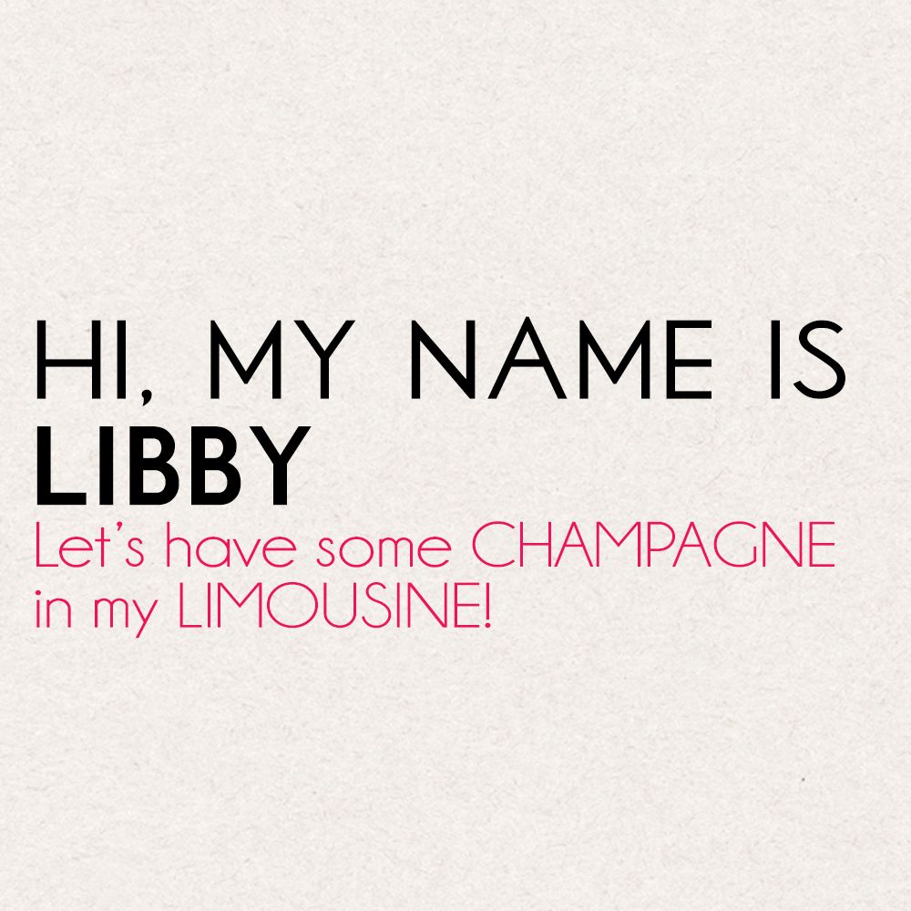
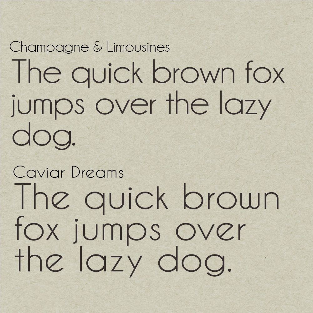
Lately, I've been loving these two fonts. I just finished a job, a poster for a band audition. I'm looking for something clean, but fun, with a retro touch. I find that Libby and Champagne&Limousines work well together! Libby is a caps only font, with two styles: regular and bold. I used Libby as like the title/headline font, and Champagne as the text. Caviar Dreams look similar.


Caviar Dreams have that distinct 'e' that sets it apart, but look at 'lazy dog'! They look identical!
I love all three, Libby is quickly becoming a favorite. Which reminds me, I need to make a favorites category in my FontBook.

Check out my other posts in the Font Fun series: FontFun